| echarts 实现仪表盘实例颜色渐变效果 | 您所在的位置:网站首页 › 渐变色 logo › echarts 实现仪表盘实例颜色渐变效果 |
echarts 实现仪表盘实例颜色渐变效果
|
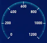
vue数据可视化大屏项目开发中需要实现仪表盘效果,效果图如下:
我们在实现效果的时候需要需要分多步走,首先是最外层向内渐变效果,加刻度加数字标识,通过使用radial colorStops 达到颜色渐变效果
中间数字 单位 以及底部说明添加,这里我们使用title来实现,并通过zlevel来讲层级设置高一点,帮忙后面被其他内容遮挡
然后是增加内第二层渐变效果,这一次的颜色是从内向外逐渐变淡,也是通过colorStops来实现
然后是增加指针,通过pointer来实现指针,设置好startAngle和endAngle让其和其他组件形状保持一致 { name: "指针", type: "gauge", zlevel: 5, radius: "70%", startAngle: 225, endAngle: -45, center: center, //整体的位置设置 axisLine: { show: false }, axisTick: { show: false }, splitLine: { show: false }, axisLabel: { show: false }, min: 0, max: 1200, pointer: { show: true, width: 3, length: "80%", offsetCenter: [0, 0], }, itemStyle: { normal: { color: '#fff' } }, detail: { show: false, }, data: [dataArr] }, 增加渐变色区域增加渐变色区域,指针划过的区域要有颜色并且是渐变色,我们也是通过colorStops来实现。 { name: '渐变进度', type: 'gauge', radius: '100%', splitNumber: 0, startAngle: 225, endAngle: -45, zlevel: 9, axisLine: { lineStyle: { color: [ [ dataArr / max, { type: 'linear', x: 0, y: 1, x2: 0, y2: 0, colorStops: [ { offset: 0, color: 'rgba(60,207,223,0)', // 0% 处的颜色 }, { offset: 0.9, color: 'rgba(50, 226, 247, 0.8)', // 100% 处的颜色 }, { offset: 1, color: 'rgba(50, 226, 247, 1)', // 100% 处的颜色 }, ], }, ], ], width: 38, }, }, axisLabel: { show: false, }, axisTick: { show: false, }, splitLine: { show: false, }, itemStyle: { show: false, }, detail: { show: false, }, title: { // 标题 show: false, }, data: [], pointer: { show: false, }, animationDuration: 4000, }, 中心圆盘中心有一个渐变色的圆盘,我们需要添加,我们需要添加一个pie来实现圆盘,并通过echarts.graphic.LinearGradient来实现圆盘的颜色渐变。 { type: 'pie', radius: ['0', '38%'], center: ['50%', '50%'], hoverAnimation: false, z: 3, data: [ { value: 100, itemStyle: { normal: { color: new echarts.graphic.LinearGradient(0, 0, 0, 1, [ { offset: 0, color: 'rgba(11, 46, 123, 1.00)', }, { offset: 1, color: 'rgba(6, 97, 191, 1.00)', }, ]), opacity: 1, }, }, label: { show: false, }, }, ], labelLine: { show: false, }, }, 遮蔽指针指针式在圆盘上的,但是又没有到圆盘中心,这时候我们需要再添加一个圆盘来遮蔽这一段的指针,为了避免突兀颜色需要和上一个圆盘颜色一致,并且层级高于指针,这样才能遮挡住圆盘。 { type: 'pie', radius: ['0', '30%'], center: ['50%', '50%'], hoverAnimation: false, zlevel: 8, data: [ { value: 100, itemStyle: { normal: { color: new echarts.graphic.LinearGradient(0, 0, 0, 1, [ { offset: 0, color: 'rgba(11, 46, 123, 1.00)', }, { offset: 1, color: 'rgba(6, 97, 191, 1.00)', }, ]), opacity: 1, }, }, label: { show: false, }, }, ], labelLine: { show: false, }, }, 最终便实现了如下圆盘效果
vue3 可视化数据大屏 - 数据资产大屏 完整代码下载 相关文件下载地址 百度网盘下载 如出现无法下载或链接失效请联系我微信:17331886870 喜欢 (0) |


【本文地址】
公司简介
联系我们